Kiln Theme

Design and development — 2018
Kiln Theme
The Challenge
Create a distinct, modern theme to attract discerning artists, and highlight the work of physical product creators.
Project Overview
Format is an online portfolio building platform serving visual artists. Users select from one of 26 themes to use as a foundation for their site, which they can customize by making changes to hundreds of design variables. Users have complete control over their site's colours, typography, and content. A theme is jumping-off point and a source of inspiration.
At the time of the project, Format was almost 10 years old and relying on many legacy themes. Web design trends, especially among artists, were changing dramatically and shifting toward large editorial imagery, asymmetrical layouts, and quirky interactions. More than ever, the design of an artist’s portfolio was an important part of their self-expression.
Format had recently launched a new Store feature, allowing users to sell products from their portfolio site. To attract users who created and sold physical objects (sculptors, ceramic artists, merchandise designers, etc), we needed a theme that would effectively showcase their work.

Creating imagery for the final Kiln Theme demo site
The Team
My role
Design and
development
At the time of the project I was working in a hybrid role as
designer and developer, maintaining and improving our theme
infrastructure. For this project, I created the design for the
theme and implemented it.
At the end of the design and development process, we spent a day
in a boardroom with a pile of cermamics, props, and backdrops to
create content for the demo site. It was a good day and a great
finale to an exciting project ☻
Design lead
James
Team lead
Garry
CX insights and Photography
Nicole
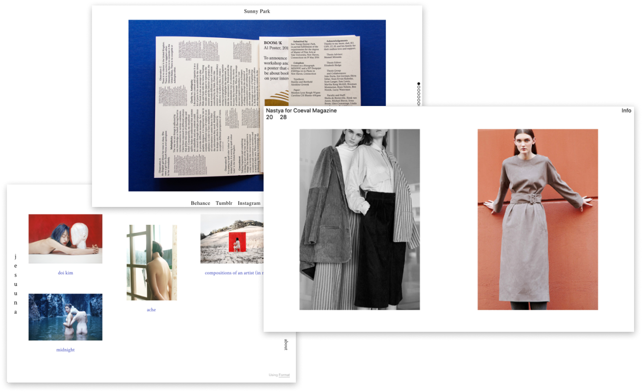
Theme Inspiration
Research and Design Process
CX Insights
Nicole helped us understand what theme features users were asking for in CX conversations, and helped validate ideas when they came up. By studying the database of user conversations in Intercom, we were able to understand what users felt was lacking in our existing theme collection. We knew that, most importantly, the user segment we were focussed on wanted their work to stand out, and for their site to represent their unique identity.
Competitive Analysis and Gathering Inspiration
Understanding the theme options available on competing platforms
helped us see the gaps in our offering, especially from
competitors focusing on the same user segment as we were for
this theme. Platforms like Cargo Collective and Squarespace are
well known for their fresh aesthetic and helped us understand
what we were missing. Shopify was a useful resource as well, to
help us understand the best ways to showcase images of physical
products.
Gathering inspiration was an essential
part of this project, as we needed a solid understanding of the
latest design trends among artists. Sites like Pinterest,
Dribbble, and web design blogs all served as sources of
inspiration for this project.
.png?v=1647640198293)
Wireframes
Wireframing and High Fidelity Designs
After gathering insights and inspiration, I created a huge
collection of wireframes, playing with layout possibilities for
imagery, navigation, text elements, store pages, etc. Our
existing theme infrastructure comes with its own constraints and
requirements, which had to be kept in mind during all phases of
the design process.
With the outlines fleshed out, I
created designs of increasing fidelity until the final deck was
prepared, which I presented to the Product Design team. After
their feedback was incorporated into the design, the design
process was complete and I began implementing the theme.

Screens from final Kiln deck
Highlights
Store
The existing store layouts were very limited and offered only a grid of small images as a user’s main storefront. As part of this project I added new layout options to the store that affected all Format themes, allowing users to showcase their products more effectively with larger imagery
Unique Design Elements
We wanted to add some unique design elements to this theme so that users could feel like their site was one of a kind. The first was logo text rotation, which allows users to rotate their logo (text or image) or the individual characters in their text logo. The second was a wiggly progress indicator on the right hand side of the page. Users were completely delighted by these features and we see them used on almost every site using Kiln!

Results
In just over 3 years, Kiln has become one of the top 10 most used Format themes, used on almost 5000 sites. Many of the top 10 themes are legacy themes that have been amassing users over 13 years, so that’s a big accomplishment! Kiln has often been the theme of choice used by the Format marketing team when showcasing the product.
Explore the theme in action on my website rightondesign.co and on the Kiln demo site.
.png?v=1648433329962)
Kiln featured on the Format homepage